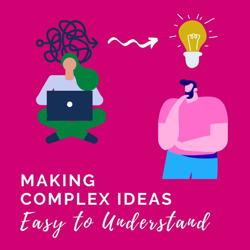
Making Complex Ideas Easy to Understand


Do you wonder if anyone actually reads your emails? Are you talking to yourself on Zoom? Are you constantly communicating the same information over and…

? It’s no secret that most people dread training. We gather in a room and stare dully at a presentation or speaker until it’s acceptable…
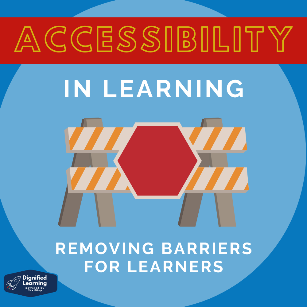
Consider your learning experiences. What factors have hindered your learning? Perhaps it was a disability, a challenge with technology, or maybe you simply didn’t have…

Have you ever been to a meeting and thought: “This could have been an email”? Have you ever been to a training and thought: “This…
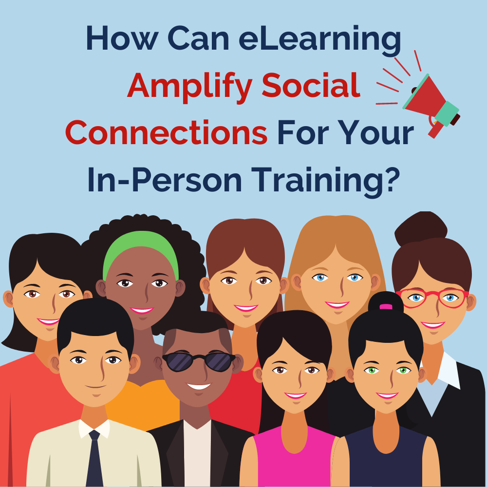
Consider this: What do we love about in person training? Most people think of community, discussions, or interaction in face-to-face training. But how often do…
Please confirm you want to block this member.
You will no longer be able to:
Please note: This action will also remove this member from your connections and send a report to the site admin. Please allow a few minutes for this process to complete.